Take heart: I checked this by taking a random screenshot, and browsing down to see how long it took me to find a commercial page. A quick sense of my trail was really encouraging:
- Open source wasm runtime
- Science transparency campaign
- Netherlands gov anti-climate change program
- open thesaurus
- GNOME conference
- France's portal of towns and cities
- Scientific measurement standardistion page
- Scientific journal
- free eBook library
- parked domain
- Linux community
- Open source graphics library
- placeholder/template blog
- A book publisher (selling books!)
It took quite a while to find a commercial site,and that itself (a bookseller) is a positive thing itself.
EDIT: I just realized, there are weird sites even on onemillionscreenshots.com. Type in obscure, older-style URLs via the search bar until you find one, then go to its screenshot. If you're lucky the surrounding sites will be more older-style and weird, less store pages.
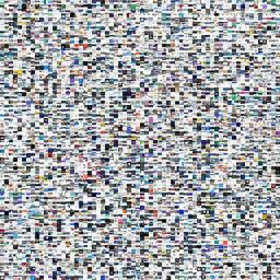
This is a neat visualization. It makes me want to build something like this with actual screenshots (scraping from places like old forums, image hosting sites, etc.) rather than web page renderings.
One of my most prized possessions is my collection of personal screenshots -- I've managed to save basically every screenshot I've taken over the past ~20 years. It's very nostalgic to put them on shuffle and see how my desktop has changed over time, remember what random thing I was working on, etc.
Could be cool to extend the concept beyond one user.
I screenshot all new sites I visit. A UI interaction catches my attention, I screenshot.
My files system is 60% images. It's an habit.
As a self-taught software dev; it helped me hone good design skills and also off topic - I poke around a lot when I visit certain websites to see which technologies they are built with. Maybe it was me testing js scripts or verifying the API/Object properties of certain functions - the habit stuck haha.
I kind of wish I had that.
The closest thing I have to this is my Steam screenshot library, which is just memories of games - or social interactions. on games. I just checked and the oldest one is back from 2011. Prior to Steam they would have been on Xfire, but as that service died, all of those are lost.
Rarely any get added these days, and they're all on private. But it's fun to look back at which games I've played over the past ~14 years.
Same here. It sounds like you even started when I did, ca. 2006. Starting from the blackberry era to my current pixel I've tried to do something similar with my cell phones, but I never usually program in that environment so I never got it off the ground. When LLMs got good a couple years ago getting a screenshot task up and running on my android was one of the first things I tried, but it's been a pain. Apparently Android has been putting in guards against that type of application for security/privacy reasons.
I have an Android, and use the free Tasker app to automatically take a screenshot of my active phone screen every 19 minutes. It takes only a few minutes to set up the Tasker script.
I have vague plans to do something with these one day. But until then, I hoard!
Did tasker do it for you? I tried about 10 yrs ago but with no success. I'll give it another go, thanks. I don't have any future plans for these but similar to OP I see them on a "pictures screensaver", sometimes on chromecast to a TV. I certainly regret not having done this in the 90s, particularly the BBS era, so that is justification enough for me to continue doing it.
I’m one of the makers of this - thank you for posting!
We built it in early 2024 and it’s due an update.
While the main visualisation is currently out of date we’ve been grabbing screenshots monthly for the last 18 months. There’s a a free (no key required) API to all the data at https://ScreenshotOf.com
I’d love to hear any ideas you have for improving it.
Thank you! This is exactly what I want to do with this. I have embeddings for all the images but hadn’t figured out the last step to getting them onto a grid like that. Can’t wait to try this.
This really makes clear how boring web design has become. 99% of websites use the same standard layout, there's almost nothing distinct or exciting about any of the designs. I remember web design being an art form, with books being printed with the best designs... I'd visit brand websites just to look at the design itself, even if I wasn't interested in what they were selling.
Of course not all is bad, but I'd love to see some creativity again, it seems like almost no one dares to break the norm anymore.
I like that we are stagnating. One of the things that took us away from the early content-focused days of the web is when every business had to get their brochures online, and every designer had to make their mark with how creative they could be. It vastly threw off the signal to noise ratio of web sites, and it delayed good UX for at least a decade because everyone re-invented menus and buttons on every web site.
Don't get me wrong. I like creativity. I am an artist, even have a degree in Fine Arts. But there are times to innovate, and there are times to just make things work. Web UX needs to just work.
The vast majority of buildings do follow the same regional templates though.
The reason they’re not specifically concrete cubes is more to do with the relative unpopularity of brutalist design than it is to do with the artistic flair of architects.
In fact I’m sure most architects would love to stamp more of their creative personality into their work but they have to dial it back for cost and practicality reasons.
Here in my area of Belgium it's become very popular to build modern cube buildings. Flat roof, featureless. No longer brick but a flat white, grey or black outside.
i find it absolutely disgusting.
We're really just reinventing brutalism but without much of the commendable outcrops like the barbican or whatever.
The only reason The Barbican (London) works is because wealthy people moved in. In my opinion, it's still a very ugly estate but it is a well maintained estate. So people can still admire its design.
Whereas other examples were left to deteriorate because wealthy people moved elsewhere. And thus all people see is dilapidated, ugly concrete.
While we are on the topic of brutalism, one of my most disliked Sci-Fi tropes is concrete buildings used as "futuristic" buildings. I honestly think the only reason they do this is because concrete is featureless so it could be from any era. If they used Victorian-style architecture or Germanic Gothic buildings then all you'd see is historic-looking architecture which would pull you out of the moment. But I, personally, cannot "unsee" concrete buildings in Sci-Fi. Everytime I see that I just see lazy set design. Plus I'd hope in a few hundred years we'd have found a better building material than concrete.
I understand that it’s easy as analogy but I also could compare to shopping carts around the world. When it’s a tool the design converge to something similar for the job at hand. For corporate businesses a website is a tool. I won’t expect an artist or museum website to look like a corporate one
I am not so sure shopping carts are that great of a counter example. There are plastic ones like target, heavier duty ones, the weird ones at microcenter, lumberyard style, hand baskets, short ones, drag behinds, ones with kids car toys built in, tiny ones for kids to yeah along, ergonomic hand baskets, etc.
Then there are the innovations people had tried over the years like different styles of kid seats, calculators built into the handle, coupon scanners built in, security boots on the wheel, Aldi store coin lock connectors, motorized baskets, Ikea escalator locking wheels.
Thinking further, the designs change across the various countries I have visited over the years.
On top of this, I can visually picture all the different styles the groceries and department stores use near me to "brand" their carts and experience directly(Target's specific branded plastic carts and baskets). The very much see the shopping cart as part of their customer experience and have experimented with different setups. One could argue that the scope of utility for a shipping cart is miniscule compared to many websites. And yet, there is actually a lot of variety.
Given how there are people dedicated to so many seemingly insignificant corporate details(email signatures and other branding activities), it seems custom "website experience rules" would slot right into that line of thinking.
Yes but in itself it’s not meant to be artistic, what you describe is to me variants of the tool. Creative variant yes, but not for art purpose. Just like a website. Maybe somewhere in the world there might be an artistic version of a shopping cart but it’s not a tool anymore and it’s not found where it belongs, in a supermarket
I’m so happy I was not the only person to notice that.
A bit quirky is exactly how I would have described it and once I accepted scrolling one direction would move the page wherever the designer wanted, I was fine.
I guess we found all the kids at Ender’s battle school that couldn’t imagine the enemy’s gate as “down”.
I do wonder how HN specific this is? Every site that has a quirky design or attempts something new gets absolutely blasted by surly people. But then someone posts a funny GeoCities style bootstrap theme and everyone goes on about how they miss when sites had a quirky touch?
I really think it's just simply about scrolljacking and not anything deeper. The GeoCities style sites have normal scrolling and the F1 site has hijacked (and very bizarre) scrolling. If your site hijacks the scrollbar then you will get complaints on HN. Keep it in mind and see how many HN complaints you read that are actually just about scrolljacking. I think readers here love quirky websites as long as it doesn't mess with scrolling.
When I “blast” a website design, it's for practical reasons, not because I dislike the design. Since I mostly read HN on my phone, every website that is slow, laggy or unreadable on mobile just stands out negatively.
From the well aged book "Don't Make Me Think", people read the web differently than books. Almost always they are there to find information or get something accomplished, not for aesthetics or pleasure (though social media has likely skewed this since it's penning)
This is why consistent UX beats out cleaver design (churn)
Like if someone wants to do crazy stuff, that’s fine, do it as an art project, whatever.
But IMO the only people who benefit when businesses and institutions are required to turn their websites into works of art, are artists. Everyone else is worse off.
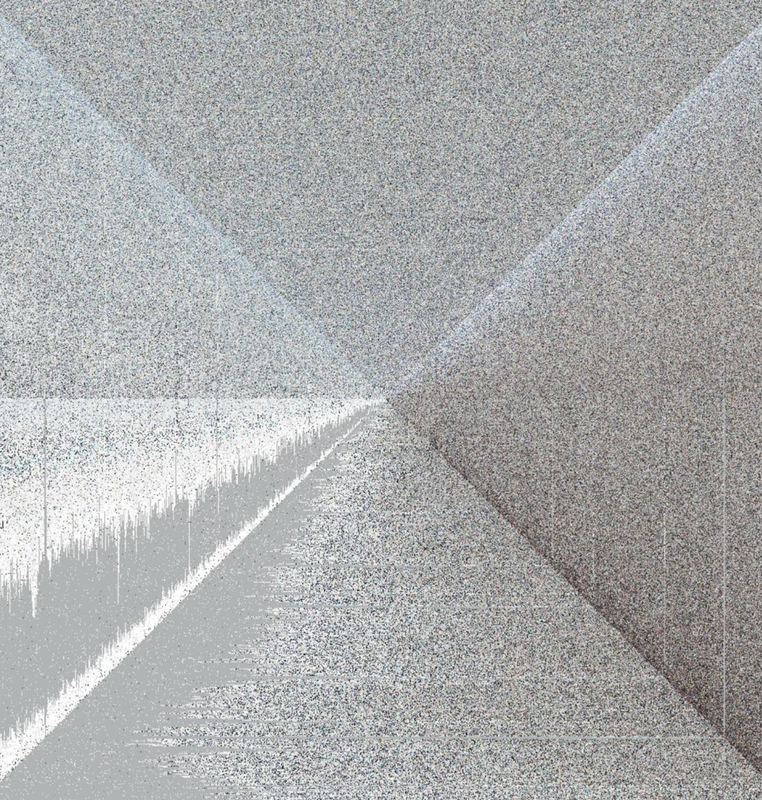
Something is weird with some of the gray areas where it'll say "this screenshot appears broken", but I thought it was just my machine. Your image looks very similar in the the broken in the same pattern. So I guess it wasn't just my connection and caching issues.
Wow, I‘m impressed. This is a really cool tool to get some inspiration as web dev. Although I have to say it‘s a bit scary how similar all the websites look nowadays…
Very cool. Would be interesting for a more niche filter criteria, since you aren't exactly finding many hidden gems in the top million mostly corporate sites. Maybe AI could provide that filter (top 1 million "niche" sites, or smaller sites that have been around since the late 90s).
Glad to see "dead internet theory" not holding up!
PS: As someone who worked on internet search, I can assure you that at least half of most popular web pages change in about 6 months time. And the change is in no way something that can be done by bots.
This is dead internet theory though. Instead of seeing personal websites we see its mostly business fronts. Internet has gone from a place where every can have their own space to a business catalog.
It is implemented using web maps technology (https://leafletjs.com/), similar to e.g. the Google Maps satellite view. The screenshots are then served pre-assembled into quadratic map tiles at different zoom levels. This way the client only ever has to load and display a hand ful of relevant tiles.
I assume that they are using some form of mipmapping, a technique by which you have several images at different sizes to represent different levels of detail. It is used a lot in 3D environments.
It would be interesting to analyze this dataset in terms of colors, layout, features, fonts, photos, etc. to be able to statistically measure the uniqueness or creativity of a given web design.
And it does it in an unusual way. After browsing around on the website and then noticing that the back button history is just the same site name repeated many times, I worried about my history needlessly polluted by this website. But when I opened my browser history, it was just a handful of URLs in there, each representing the screenshot I had actually clicked on.
So, yes, it does break the back button, but it doesn't pollute the actual history.
My younger bro makes music, my older bro (a dev like me) critiqued his new vocal track just this evening. I said it’s fire; he called it cliché. We exchanged looks, and my younger bro quipped, “Perspective is all it’s about.” We laughed.
reply